×
MELBOURNE RECITAL CENTRE REBRANDING

By Studio MASS
Using PORTERON
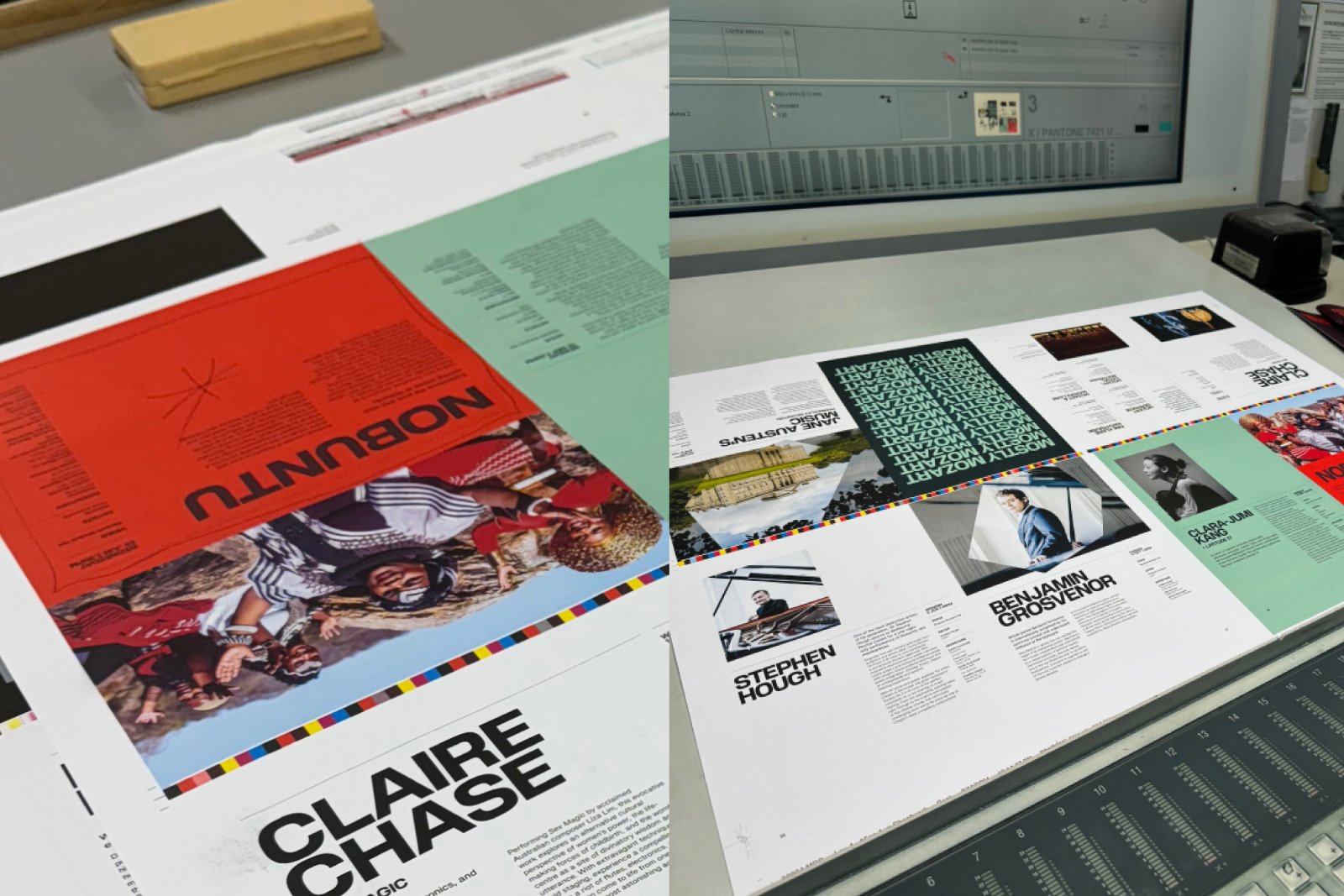
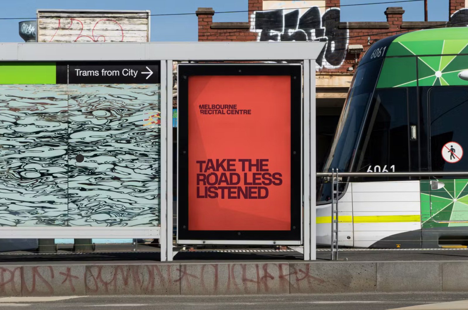
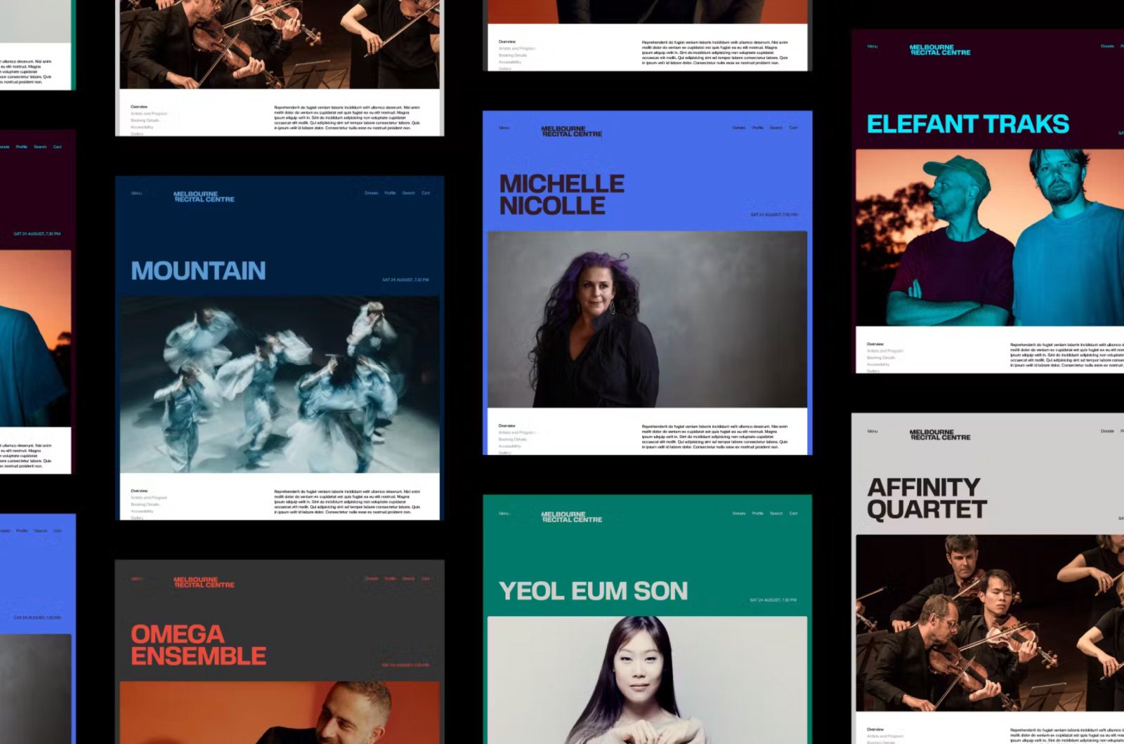
The Melbourne Recital Centre’s recent rebranding, featuring Porteron as the new brand typeface, harmonizes its unique architectural features with its cultural mission. This typeface selection was crucial in developing a new logo marque that subtly incorporates these geometric shapes, enhancing the visual narrative of the Centre’s iconic window structure. The integration of Porteron allowed for a typographic treatment that complements the strategic positioning of “Music for the daring,” aimed at attracting a diverse and adventurous audience. This rebranding initiative also included innovative design elements such as a sound-reactive hexagon, which uses audio to dynamically inform the visual identity, reflecting the vibrancy and diversity of the music performed at the Centre. Studio Mass’s thoughtful application of Porteron not only strengthened the Centre’s cultural identity but also ensured that every touchpoint, from the website to promotional materials, resonated with both clarity and creativity, providing a fresh, engaging experience for all visitors.


[ UPDATE ]
We're proud to see the Melbourne Recital Centre rebrand receive such broad recognition across national and international design awards:
Melbourne Design Awards 2025, Gold
Best Awards 2025, Silver
AGDA Awards 2025, Distinction (Expression, Digital)
AGDA Awards 2025, Finalist (Books & Guidelines)
Premier’s Design Awards 2025, Finalist
Good Design Awards 2025, Gold
Australian Design Awards 2026, Gold
World Design Awards 2026, Gold
